So it’s Thanksgiving week, right? And in a few days we’ll be breakin’ out the ribbon for decorating and wrapping presents. So why do a painting tutorial for a bow and ribbon then?
- It’s a great way to ‘frame’ a painting.
- It’s super easy, and therefore fast, to paint.
- It’s a great way to integrate a contrast color into a holiday painting.
Which is why my bow and ribbon are turquoise. I mean, all three reasons. I needed a frame for a couple of paintings and I wanted to add some turquoise. And I always like things that are fast to paint.
Wait, one more reason – you only need 3 colors of paint.
A medium color, a color that’s a little darker than the medium, and white. So this would work for any color you want – red, green, purple, whatever.
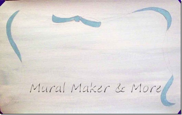
After sketching the pattern, I painted the medium color on the ‘outside’ of the bow loops. Then I just picked the areas on the ribbon streamers that I wanted to be the main color.
It’ll make more sense as we go along. I hope.
I did two paintings, which I’ll show you in a couple of days, so I did a slightly different bow on each one.
I also did the shading differently on each painting.
For this one I painted the ‘inside’ of the bow loops and the remaining areas of the ribbon streamers with the deeper shade of turquoise.
And then I realized it looked too dark for the effect I was going for.
So I mixed the medium and dark colors together for a little less contrast.
Now, I usually don’t tell you to mix colors in my tutorials because it winds up being a ‘by-eye’ kinda thing. Most people don’t like that – they want to know precisely which colors I’m talking about.
But I didn’t have a lighter paint color on hand so just for this one time I mixed a couple of colors, alright?
And what a difference, don’tcha think, compared to the one above with the darker shading?
Yeah. Much better.
Okay, so you paint the medium shade and then paint the darker shade. And you’re almost done.
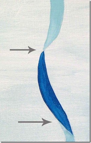
There’s just a couple of areas that you want to pay attention to . . .
. . . where the ribbon ‘flips’. You gotta get that teeny-tiny corner painted in. I used a liner brush for it.
But look at the difference! Now it actually looks like the ribbon has two sides, doesn’t it?
Well, since we broke out the liner brush, we might as well add a little detailing on the bow loops. Just a few curved lines will do it.
If they look too dark to you, just add another layer of the medium color over them and they’ll soften up a bit.
Now for the highlighting with white.
If you think about shiny ribbon, there are parts that actually look white wherever the light hits it – usually on the curved parts. So that’s where you paint the white highlights – on the curved parts.
To get a bright white, you may need 2 or 3 coats. But it’s totally worth it.
Kind of shiny lookin’!
And the ‘too dark’ one . . . I just couldn’t stand it so I topcoated the dark turquoise with the medium color.
So if you don’t wanna mix colors, you don’t have to. Just layer your colors like we always do!
But we need something to go with the bows and ribbon. I’ll share that with you next (if all goes well!).


No comments:
Post a Comment