Well, I mean, when I’m doing a commissioned painting, that is. Usually my clients have some sort of idea of what they want. Maybe they know the colors, or maybe the image. Although sometimes they really don’t have any idea.
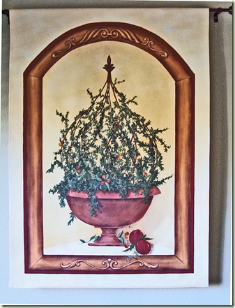
For the wall hanging above, this is how we started.
- She wanted something for her dining room.
- She wanted a wall hanging, not a stretched, framed canvas.
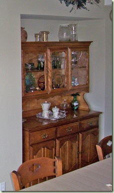
- She wanted some of the colors of her oak hutch included.

- She wanted tuscan colors to ‘pull’ her kitchen colors into the dining room.

Seemed simple enough, right?
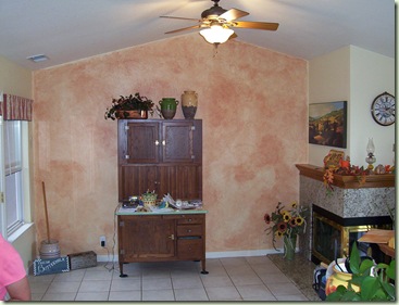
But here were some of my issues. Her kitchen, which adjoins the dining room, is full of warm tones – reds, golds, etc.

I’m not sure you can tell from this picture, but the wall color over the fireplace is actually a butter yellow – really quite warm.
We put the color wash behind the hoosier cabinet.

We just took a burnt red, mixed it with glaze & water and ragged it on to the existing butter yellow.
So the kitchen and nook had these wonderfully warm tones. But the dining room? Not so much. The wall color was more of a cool taupe.
This is what I always do. Always. Simple watercolor renderings. They’re obviously not highly detailed, but they give the client and idea of form, scale & most of all – colors.

In this first one I made the surround the warm butter tones and made the arch more of the grey/taupe colors. She wanted pomegranates no matter what. Eh, it was just o.kay.

In this second one I added a very pale yellow, warmed up the arch to bring in the oak tones of the hutch. I also brought a terra cotta color to the urn to pull the kitchen colors in.
Here’s the final piece again.

You can see I added the pomegranates, toned down the colors of the arch a bit, but it’s pretty close to the rendering, don’t you think?
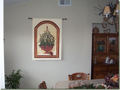
Here’s how it looked hanging in the dining room.

See what I mean about the grey/taupe of the wall color? Even in this picture, the wall hanging looks too yellow. But it’s really okay in person. When you see the entire room, there are many warm-toned elements which make the wall hanging complementary.

Notice the chandelier shades. See the warm tones? Even the window valance had a little warmth to it.
So that’s how I work! It’s really fun, believe me. It’s such an honor to be invited into someone’s home, peek around at decor, colors, style, etc., and try and paint something that not only will hang in their personal space, but that they are investing in as well.
I’ll say it over and over and over – I have the best job in the world! Of course, now it’s even better because I get to blog about it too.
I’m linking up to these great parties today.
Colleen
Great art Collin!
ReplyDeleteThis is awesome! You are so creative and talented!!! You give me so many ideas and motivate me to try new things! THANKS for sharing!!! Have a Great week! ~ Coreen
ReplyDeleteI love popping in here to see what you are up to. I'm always amazed!! Love the paintings....and it was fun 'seeing' the process. Thanks!
ReplyDeleteHappy Spring!
~Caroline
How pretty!
ReplyDeleteI would love it if you joined my "Saturday is Crafty Day" party starting on April 24th! Stop by my blog for details.
LOVE it! I am headed to your home page to check out more! I am glad I found you! I came from the power of paint party!
ReplyDelete~Bridgette
Great tips for if you're painting art or even if you are picking out art for a space... Thanks!
ReplyDelete