Here’s a common mistake I made when I first started painting murals – I spent a ton, A TON, of time on backgrounds. Backgrounds are the first thing you paint – or, at least they should be – and when I start a new project, I have a tendency to get absorbed in the details.
Okay. So even in the middle and end of projects, I still am absorbed in the details.
It’s something I’m working on, at least with my paintings.
Back to this mural rendering. Remember the sketch from yesterday?
Okay, this is a super simple way to paint hills, for murals or any other painting too.
I used Plaid Folk Art paints for this rendering. For murals, I use whatever I have on hand – housepaint, samples, etc. – for basecoating and coverage, then I pull out my artist tube acrylics or Plaid Folk Art for detailing. That’s just my preference, though.
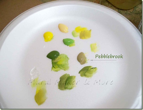
I used a medium green (Hauser Green Medium), a light green (Fresh Foliage), yellow (Daffodil), a creamy yellow (Sunflower) and my new favorite color – Pebblebrook! It’s kinds of a grey-tan-light green. It’s fabulous for blending with greens and yellows to tone them down a bit. Mute the brightness, you know?
Let me explain . . . I’ve used craft paints to paint murals, furniture, canvas, everything, for years. It’s not that I don’t know how to mix colors. I do. But I worked in a craft store and got used to using 99 cent paints. And I love them!
I ‘know’ the colors. They’re like friends. I know which blues I use for skies or water, which greens for pine trees or grassy fields.
Could I mix these colors? Sure! And oftentimes I do use artist tube acrylics. But now I spend so much time teaching and writing tutorials, I like using craft paint, in particular, Plaid paint.
Here’s why. If I tell you to mix Hauser Green Medium with Pebblebrook to get a really cool ‘hilly’ green that’s not too green, I know you’ll get a good result.
If I say mix a ‘medium’ green with a greyish tan, who knows what shade you’ll get.
Now, if you’re adventurous and want to try your own shades, Great! Go for it! I’ve just found most of my students (like 99%) want detailed instructions, easy-to-follow patterns, and specific paint colors. So that’s what I do.
{stepping off my soapbox now . . . }
The tendency will be to paint each section of the hillside separately.
Resist the temptation.
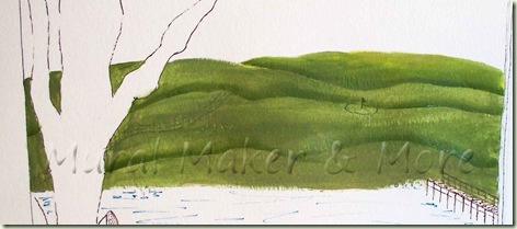
Mix some Hauser Green with some Pebblebook and slap it all over your hills in horizontal strokes. Don’t worry if it’s lighter in some areas and darker in others. In fact, that’s a good thing, as opposed to a completely opaque green.
Now take straight Hauser Green and paint some slight curves.
Right next to the Hauser Green, take some Sunflower or Daffodil + Pebblebrook and paint the ‘tops’ of the hills.
Simple, huh?
- Basecoat
- Medium Green curves
- Light creamy Yellow highlights next to Green curves
And you have Hills!
Now, here’s the most important tip of all . . .
. . . always, always, always . . .
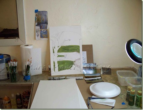
stand back from your work. I don’t care if it’s a wall mural or a greeting card, stand a few feet away and get a fresh perspective. If it’s a wall mural, you might have to actually leave the room and come back in a few times. But it’ll be worth it.
Tomorrow – simple water and trees.
Really, really, simple!


No comments:
Post a Comment