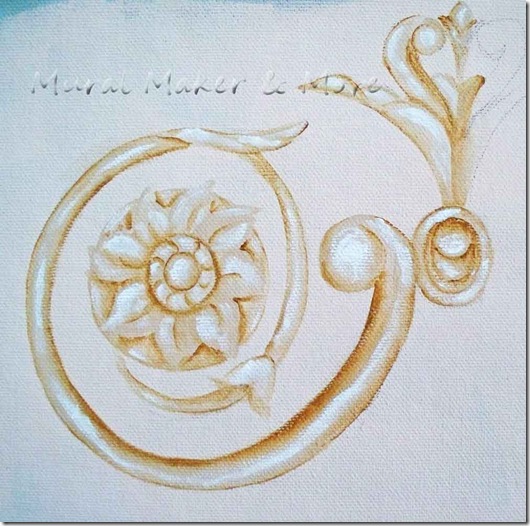
My first instinct was to go with classic ‘baroque’ ornaments for a border around the mural. Even though it’s for a baby, I liked baroque for it’s timeless elegance.
I used this sketch as my inspiration.
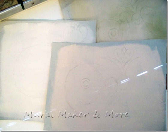
A few different shades for backgrounds and then I quickly sketched the pattern. These are just samples for the clients so I wasn’t going for perfection.
For once.
The background of the fabric is ‘petal pink’ but it actually has a slight salmon hue to it.
I’ll stop by HD and have a sample made to match.
Love those $3 sample paints!
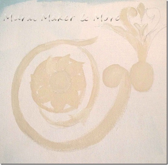
I started with the basecoat.
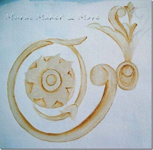
Then the first layer of shading.
If the clients choose this option, I’ll draw a pattern so everything is exact and symmetrical on both sides.
Today, I just wanted to see how it looked.
A little more shading on the opposite side of the scrolls. This will make the scrolls appear more 3-D.
Then some white highlighting.
Highlighting is my absolute favorite thing to do. It’s like the painting comes to life.
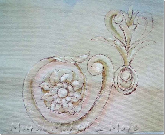
A little more shading here are there and the ‘painted’ version is done.
The top scroll is outlined with a finetip marker; the lower one is just paint.
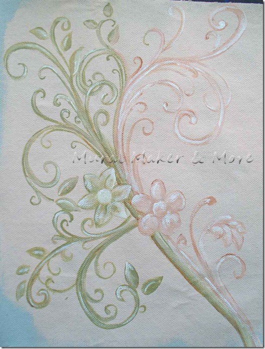
But just in case the clients aren’t ‘feelin’ the baroque, I wanted something a little more . . . contemporary.
I only had to look as far as my idea board!
Scrolls and scrolls and even more scrolls. With a leaf thrown in here and there.
Then I darkened some of the scrolls.
Then made them wider and added some highlighting.
A little detailing with a fine tip marker and this version is done.
I like both versions, but it’s up to the clients to decide. Thank goodness!
Next up, the body of the wall hanging.
Yes, Folks – this entire week will be pink and girly!










Thankyou for this beautiful tutorial. I'm hoping to do a Chanel-esque (Chanels interior design style was wildly different to her personal style) makeover of a few items here, and will feature this if I can manage to master it...I'll let you know when I post it on my blog. Mimi....xxx
ReplyDelete