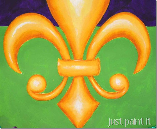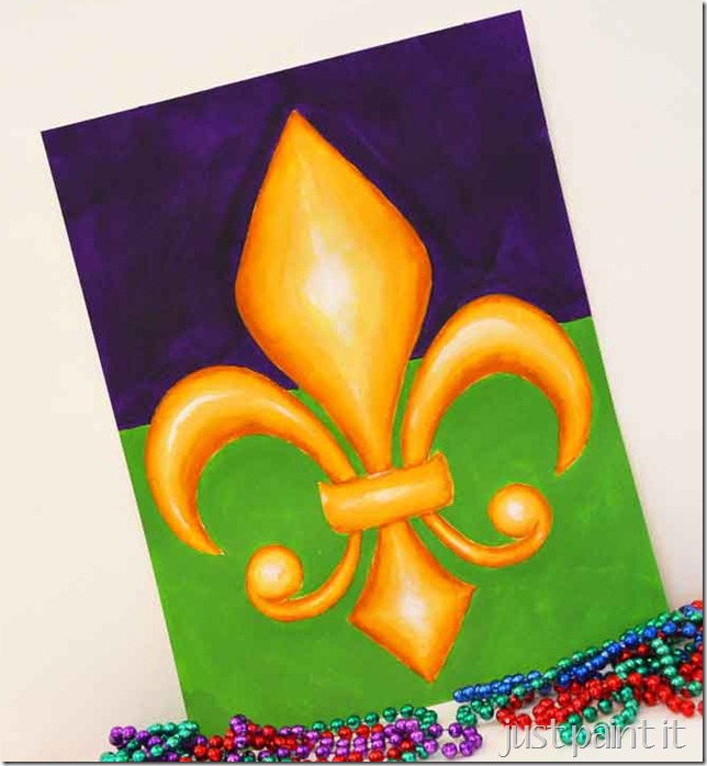
A couple of weeks ago a new reader emailed me, saying she wanted to paint a fleur de lis and did I have any tips. With Mardi Gras coming up (ok, it’s most likely passed by the time you read this) I thought why not just paint one and show her step-by-step?
So I did what I always do, I googled images and entered “fleur de lis”. Geezlouise. Who knew there were so many types & styles of fleurs de lis?
She had mentioned she wanted rich colors so I added “mardi gras” and my eyes were treated to an explosion of purples, greens & golds.
But she also wanted dimension. Ok, I can do that. Then she used the magic word – she wanted it to “pop”. If you read my 3D Star post, you know why that word means a lot to me.
That star post is a good tutorial for painting dimension too, btw, but I painted ridges on the star. This fleur de lis is just dimensional, no ridges.
I liked this image above but wanted to make it simpler, for a new painter.
If anyone knows what it’s like to take on a project that’s a bit too complicated, it’s me. Painting should be fun. Challenging, maybe, but it should be enjoyable too. Otherwise you won’t keep painting!
I found these stencils but they’re only about 3 inches tall. Too small to demonstrate shading & highlighting.
Nope. I might as well draw one. (don’t tell anyone, but sketching is truly my favorite thing to do. Even more than painting. ssshhh.)
If drawing isn’t your favorite thing, just print a pattern from Google Images. I won’t tell if you won’t.
Remember drawing hearts in school, how you’d fold a paper and just draw half of a heart, then cut it out and have two matching sides? Any time you want to draw something symmetrical, do the same thing – fold the paper in half.
Then you only have to sketch one side. I used tracing paper, but lightweight copy paper will work too. Darken your sketch with a black marker. Transfer that side of your pattern on to your canvas or watercolor paper. Then flip your pattern over & transfer the opposite side and you’ll have a symmetrical drawing.
And you won’t have to drive yourself crazy trying to get all the curves even and everything. Not that I’d know anything about that, you know.
Oh, okay. I hate to admit how many years it took me to figure out something so simple. Years! That’s the price I paid for not taking art class, ha.
I decided on a gold fleur de lis. Whatever color you choose you’ll need:
- basecoat color
- a shade darker
- two shades darker
- two shades lighter
- white
If you paint on watercolor paper, you’ll want floating medium too. It just makes the paint flow easier.
I transferred the pattern first and then basecoated around it, simply because the purple was so dark. It would’ve taken a lot of coats of yellow paint to cover the basecoat.
With the paint that’s one shade darker than the basecoat – in this case “Antique Gold” – outline the entire shape. You can see where some shadings are wider than others. It depends on the overall part – if it’s wide, I add a wider stroke of shading. But it’s up to you.
I also use a flat brush (a square shape) and dip one corner into paint. It’s called side loading. But don’t stress out over it. The more you do it, the easier it gets.
Keep telling yourself that, k?
Because now you’re going to add your first layer of highlighting. First, ok? For this layer, use the shade lighter than your basecoat to the center of each part.
Don’t worry about it being all even. As a matter of fact, it’ll look better if it’s not all even. Light is rarely distributed evenly on a piece.
See – look at the difference between the left and right curves. Not the same, are they?
Since we’re using craft acrylics, the brightness of the highlighting and shading will recede as it dries. Keep that in mind too. You’ll probably want to add another layer of each. But it’s up to you. Just wait until it dries before you decide.
This pic has an additional layer of highlighting but not shading. Do you see how just the extra highlights made the shading look darker?
But it’s not “popping” yet, is it?
So add some shading with the paint that’s two shades darker than your basecoat. I used “Raw Sienna”. What a difference, right?
But wait. One more step before it pops. And for that you have to use “White”. Yep, the brightest white you have. Try not to freak out. Too much. Let it dry first and then stand back, a good 3-4 feet, and then look at it again.
White makes it pop. Yep. It does.
You don’t need to cover the entire highlighted area with white though, just some touches.
Let it dry, step back and look at it. You can always add more, and chances are you’ll need to add 2-3 coats of white.
And don’t be surprised if you don’t find yourself adding another layer of shading. And then another layer of highlighting. And then . . . welcome to the wonderful world of painting.
Isn’t it fun?!?
Now, if it’s not “fun”, if you’re totally frustrated because you see brushstrokes instead of blended colors, don’t freak out. Just take your basecoat, your original color, and cover the entire, yes ENTIRE, piece. Then let.it.dry.
It won’t have as much dimension as the one I painted but it’ll still look dimensional. The more you paint, the better you get. Believe me, I’ve spent hours and hours shading & highlighting, highlighting & shading. It’s my meditation.
And it’s fun.
Happy Painting. And Happy Mardi Gras!
p.s. Check out some of my friends’ Mardi Gras posts too!
- Free Mardi Gras Doubloon Printables by My Very Educated Mother
- Crockpot Gumbo by Lazy Budget Chef
- Beaded Mardi Gras Wreath by Crafts n Coffee
- Mardi Gras Photo Props by Create Craft Loves
- 5 Minute Mardi Gras Tinsel Wreath by Create Craft Loves
- Family Friendly Mardi Gras Celebration at SNAP Creativity
p.p.s. Did you notice my two new painting classes in the sidebar? Spring flowers! If evening classes don’t work for you, let me know a day/time that does. I can add one more class & I’d like to add a daytime class. Just leave a note in the comments.
Colleen
about Colleen


No comments:
Post a Comment